Year: 2018
Client: Private
Blockhouse Bay, Auckland
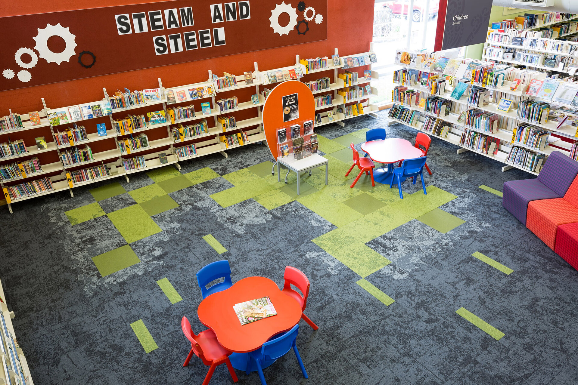
The interior palette of the Blockhouse Bay Library refurbishment references and evokes memories of the Bay. It speaks of the transition from the land folding around the beach, to the water, which then connects to the Manukau Harbour.
The walls are a lush palette of vibrant colours reminiscent of the Bay on a summer's day - the red of the pohutakawa flowers in full bloom, flax yellowing in the hot summer sun, the varying tones of green within our dense native bush with its filtered light, and finally the murky teal of the bay itself.
Carpet tiles selected for the library were chosen from Interface's Net Effect collection - a collection made from recycled fishing nets, the tile design tracing tidal patterns. Using this pattern, the carpet traces the Manukau Harbour, tracing the water, the shoreline and the land - a lighter tile giving way to darker expanses of water, the Harbour.
Visitors enter the library through the mouth of the harbour - green and red channel markers on either side, located close to the shoreline. Throughout the library, these bold, bright channel markers work to indicate a series of key areas within the library - including the service desks, self issue, the children's zone. In the Children's Space, the monochromatic palette of the main tiles gives way to a playful array of green, the subtle textural variations adding interest and encouraging interaction.


Contact us
Phone: 09 973 5338
Email: studio@makearchitects.co.nz
Address: Suite 4/Level 2, 30 St Benedicts Street, Eden Terrace, Auckland 1010
